

Colour
CMYK – Also referred to as the four-colour process. The abbreviation stands for CYAN, MAGENTA, YELLOW and KEY (Black). This colour model is in reference to the 4 inks used in colour printing.
RGB – Also referred to as RED, GREEN & BLUE. This colour mode is typically used for screen-based Graphic Design only and viewed on screens such as computers, tablets and TV’s.
Pantone – The Pantone Matching System is the standardised colour system for print and Graphic Design, from the company Pantone® who provide inspiration, specification and printing accuracy.
Palette – The Palette is simply a collection of colours used in Graphic Design to create a range of different media.
Printing
Resolution – The resolution is the number of units that occupy a linear inch in an image. You can measure it in terms of PPI, or ‘pixels per inch’ on a screen. In printing, it’s referred to as DPI, which means ‘dots per inch’.
The standard DPI for any image requiring printing is 300dpi, whereas online based imagery, such as that on a digital screen or website is 72dpi.
Bleed – Bleed is a term used in printing to describe images or blocks of colour that extend beyond the artboard, this is put into place to make sure that nothing important is cut off, it is a helpful thing to include on any document sent to a printer. Bleed is typically in most cases 3mm.
Crop/Trim Marks – These marks are put in place on the exportation of a document to indicate to the printer where they should cut the artwork.
RIP – This term stands for ‘Raster Image Processor’ and it is a software accessory that works as an enhanced printer driver, it will allow production of the highest possible output for text, vectors and bitmaps.
Types of binding and folding
Single Fold – This is the simplest type of fold, where the sheet is folded once in the middle. For example, taking an A4 sheet and folding in half you will end up with an A5 folded leaflet. For this reason, it is often called a half fold.
Roll/Tri-Fold – This type of fold is where each page folds in on itself. It is typically used to produce a tri-fold leaflet such as a one-third A4 leaflet or a DL leaflet. This is where an A4 sheet is folded into three sections, the right-hand page is folded inwards and then folded in again.
Gate Fold – This type of leaflet will typically have two parallel folds, the left and the right-hand pages are folded inwards so that they meet in the middle. It looks similar to two gates opening outwards and it reveals the larger panel underneath. A gate fold leaflet can be any size but its final size will be half the original sheet size.
Z Fold (Concertina) – A concertina folded leaflet (also known as zig-zag folding or z-fold) looks a lot like an accordion, especially when it has more than 6 pages and depending on its size it can have up to twelve pages. Each page will be the same size and the leaflet will open out to one long document, this can allow information to run from one page on to the next.
Cross Fold – A map is an example of a cross folded leaflet. It allows a large printed sheet to be reduced in size just by folding it down several times. There are a number of ways to do this but normally the sheet will be folded in half and then folded again one or more times. A sheet folded into quarters is known as a French fold.
Saddle Stitch – is a method that uses a long metal wire to bind your booklets together. It works a lot like a sewing machine; the stack of collated sheets gets fed into the machine, then ‘jogged’ to make sure they’re stacked neatly. The machine then pierces the paper and feeds the roll of wire through the stack, before the wire is folded into something that acts as a staple.
Perfect Bound – It’s achieved by glueing a stack of paper on the spine edge using PVA glue, before wrapping a cover around it to secure. The result is essentially a paperback book; clean, stylish and professional.
The rule of thumb for Perfect Bound is to have a minimum of 40 printed pages. Any less than that and the spine won’t be substantial enough to take to the glue. Most often, the cover will be thicker than the inner pages.
Perfect Binding is best suited for, it’s usually the kind of booklet that is kept and referred back to; so, catalogues, directories, prospectuses, car handbooks and self-published novels.
Comb Bound – The process involves using a specialised machine to punch rectangular-shaped holes into a stack of paper before it closes a plastic comb through the holes to bind your booklet.
Spiral/Wiro Bound – The Wiro binding process is pretty straightforward; a stack of paper is hole-punched down one side and an open metal wire is then placed through the holes and closed around the stack. A Wiro bound booklet will usually have a hard back made from card. This is there to support the pages and act as a sturdy surface to write on. As pages are slid into the stack individually.
Types of image or file format
JPEG – Stands for ‘Joint Photographic Experts Group’ and it is a common file format used in Graphic Design for saving imagery due to its wide variety of compression range. They can be saved in many ways on a sliding resolution scale, for example, you can save a high-quality JPEG for use in print, medium for web-based graphic design and low for attachments to emails.
EPS – Stands for ‘Encapsulated Post Script’ it is usually used in Adobe Illustrator and is the common format for saving vector-based images.
PNG – Meaning ‘Portable Network Graphic’. This format has built-in transparency, but can also display higher colour depths, which translates into millions of colours. PNGs are a web standard and are quickly becoming one of the most common image formats used online.
PSD – Stands for ‘Photoshop Document’ and it is an original design file created in Photoshop which is fully editable with multiple layers and image adjustments. PSDs are primarily used to create and edit raster images, but this unique format can also contain vector layers as well, making it extremely flexible for several different projects. A PSD can be exported into any number of image file formats.
AI – Stands for Adobe Illustrator. The format is based on both the EPS and PDF standards developed by Adobe. Like those formats, AI files are primarily a vector-based format, though they can also include embedded or linked raster images. AI files can be exported to both PDF and EPS files (for easy reviewing and printing), and JPEG, PNG, GIF, TIFF and PSD (for web use and further editing).
PDF – PDF stands for Portable Document Format and is an image format used to display documents and graphics correctly, no matter the device, application, operating system or web browser. At its core, PDF files have a powerful vector graphics foundation, but can also display everything from raster graphics to form fields to spreadsheets. Because it is a near universal standard, PDF files are often the file format requested by printers to send a final design into production. Both Adobe Photoshop and Illustrator can export straight to PDF, making it easy to start your design and get it ready for printing.
Paper stocks
GSM – is an acronym standing for ‘Grams per Square Metre’. Quite simply, it allows print buyers and print suppliers to know exactly about the quality of paper that is being ordered. The higher the GSM number, the heavier the paper.
35gsm to 55gsm: This is very thin paper indeed. Most newspapers will commonly be printed on this paper thickness.
90gsm to 100gsm: This is the weight of most household printer paper. The stuff you might pick up in packs of 500 sheets at the office depot.
120gsm to 140gsm: This GSM range covers the paper thickness of most posters you’re likely to find on pub walls etc. Paper with this GSM is sturdy enough to withstand a bit of wear and tear. It is also the thickness of low-cost flyers you might have had posted through your front door by taxi companies.
210gsm to 300gsm: Moving onto premium flyers now. This GSM range will cover most of the sturdy printed flyers you get given in the high street. This paper stock range is approaching card but will still have a bit of a bend when held with two fingers. Think of the magazine covers you see on the racks at newsagents
350gsm to 400gsm: This GSM is essentially card. It will stand up under its own weight and is most commonly associated with premium flyers and business cards. As well, it is likely to be the stock that high-quality wedding invitations are printed on.
Typographer’s terms
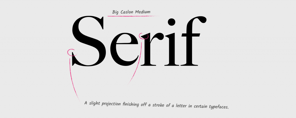
Serif – A short line or stroke attached to or extending from the open ends of a letterform; also refers to the general category of typefaces that have been designed with this feature.
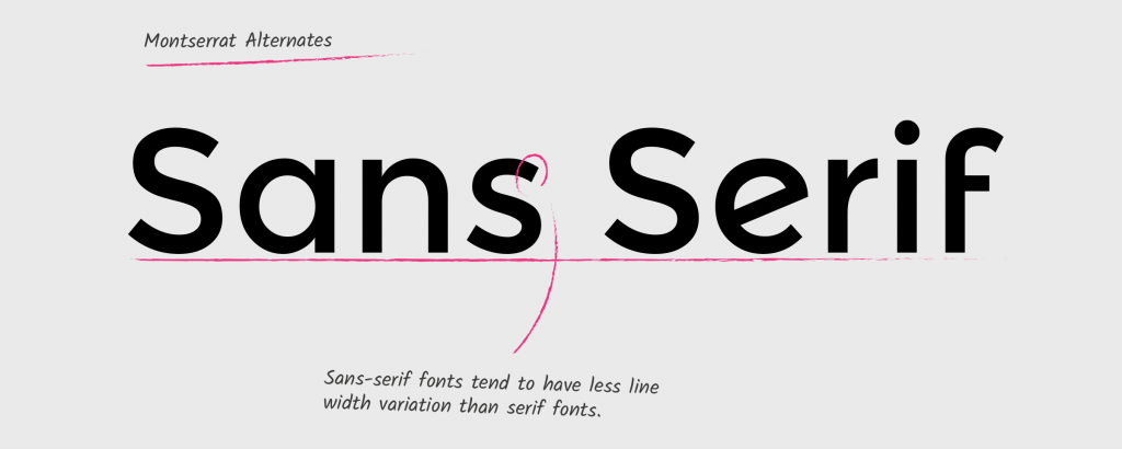
Sans Serif – Literally ‘without line’; the general category of typefaces (or an individual typeface) designed without serifs.
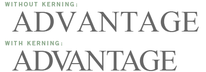
Kerning – The horizontal spacing between two consecutive characters; adjusting the kerning creates the appearance of uniformity and reduces gaps of white space between certain letter combinations.
Leading – the distance between two baselines of lines of type. The word ‘leading’ originates from the strips of lead hand-typesetters used to use to space out lines of text evenly. The word leading has stuck, but essentially it’s a graphic design term for line spacing.
Tracking – Tracking is very similar to kerning in that it is the spacing between individual characters, but tracking is the space between groups of letters rather than individual letters. Tracking affects the overall character density of the copy. Other than the actual effect that it could have on readability of type, tracking would be used to make lines of type even.
Point – This is utilised to measure the size of a font. As a rule, one point equals just 1/72 of an inch.
If a letter is referred to as, for example, 24-point, this means that the whole height of the text block is being indicated, not solely the character on its own.

Urban Feather work hard to understand your brand and how you want people to see your business. No changes are too much trouble plus I love their creativity and flair!
Dr. Julia Pullin DC, Principal Chiropractor & Director, The Chirohealth Clinic


+44 (0) 1724 897 497
[email protected]